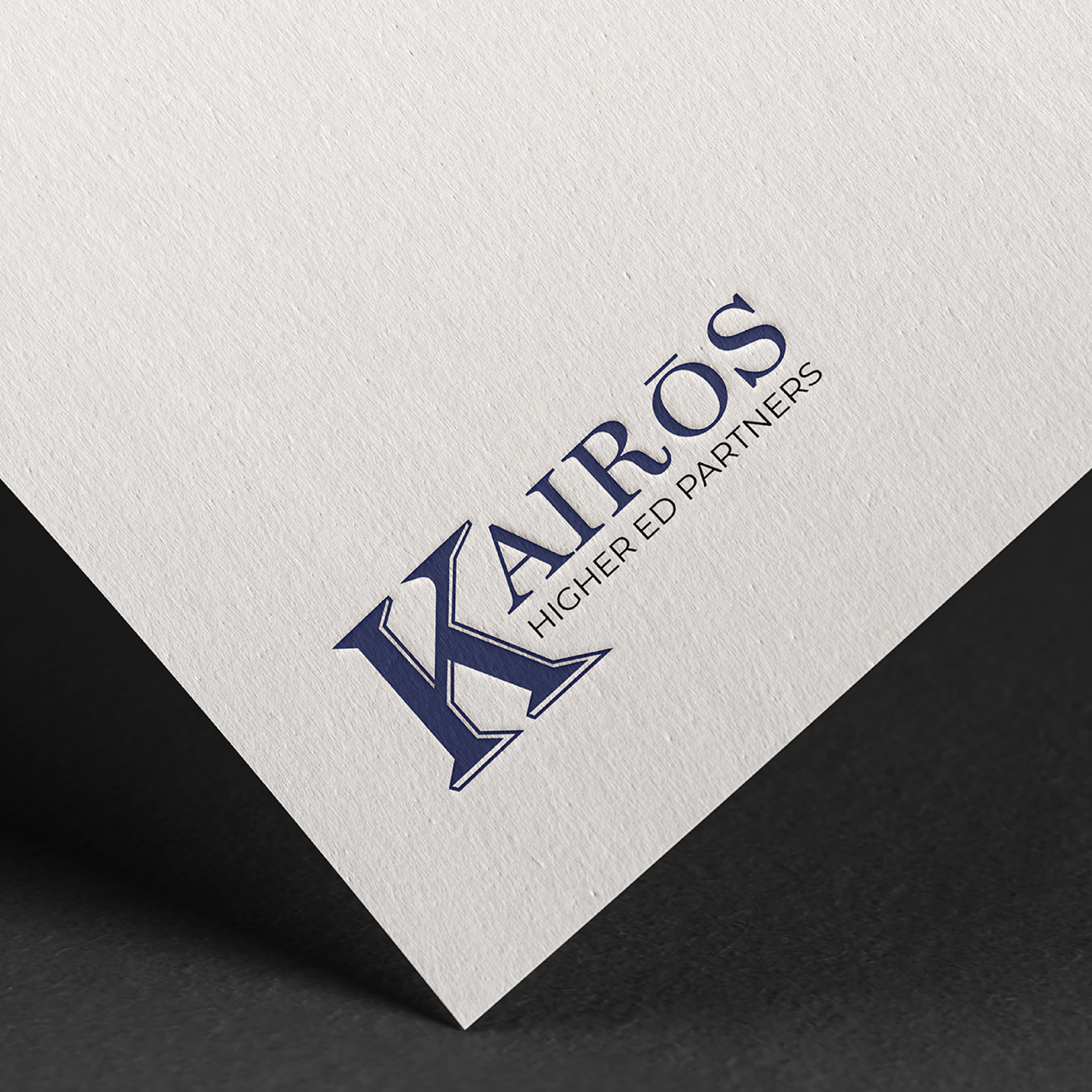
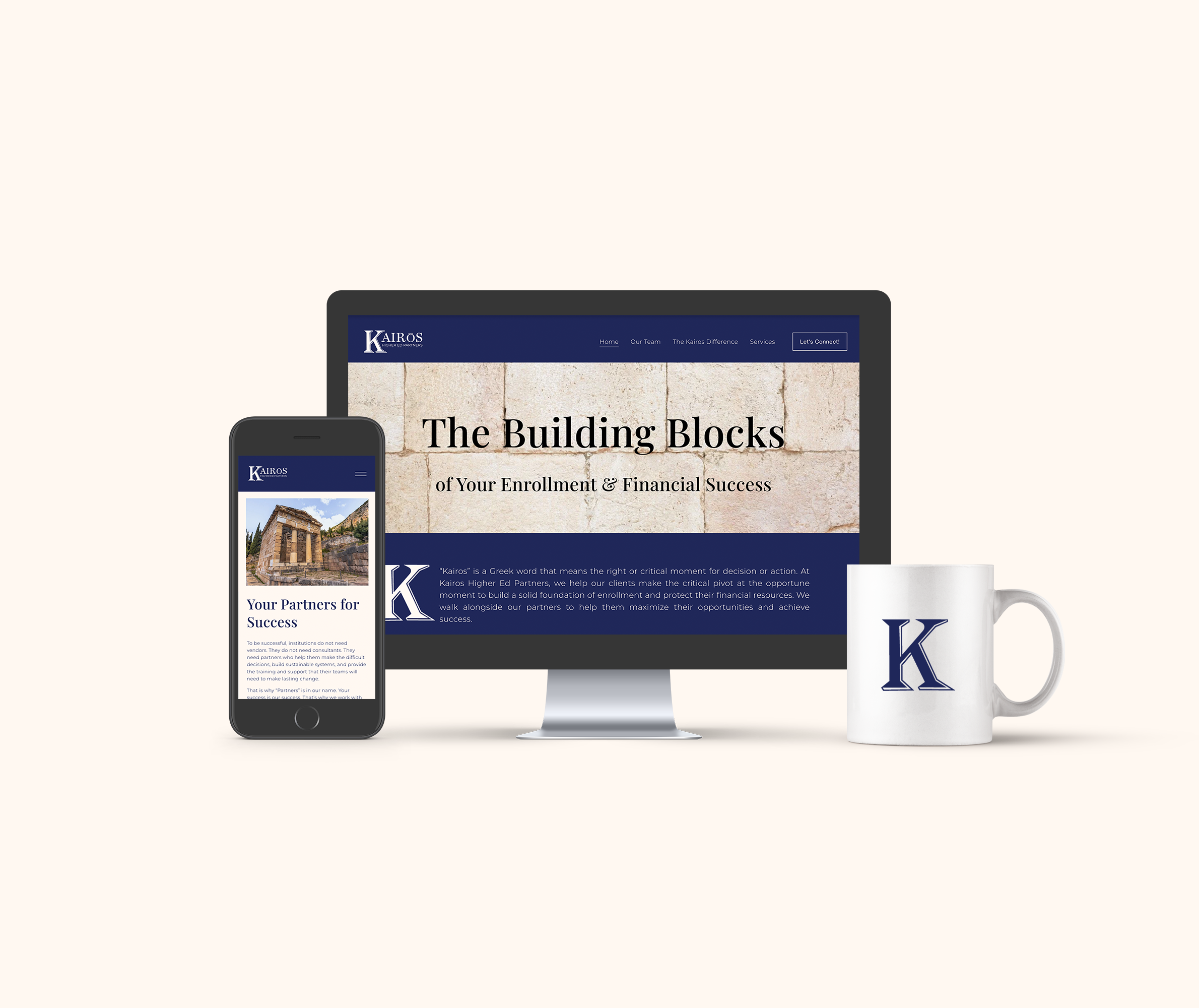
The Kairos Higher Ed Partners logo combines classic typography with modern refinement to convey credibility and intelligence within the education sector. The design features a prominent, stylized “K” that establishes a strong visual anchor and reflects stability and leadership. A serif typeface was chosen for its timeless, academic character, while the accent over the “O” adds distinction and cultural depth, referencing the ancient Greek origin of Kairós (“the opportune moment”).
A deep navy palette reinforces professionalism and trust, and the clean, balanced layout ensures adaptability across print and digital applications. The result is a sophisticated, typographically driven mark that feels both traditional and contemporary — aligning with the brand’s mission to bridge higher education and forward-thinking strategy.